
Storybook
최근 프로젝트를 진행하면서, 그동안 진행했던 프로젝트 들과 비교하면 가장 내용이 많은 축에 들었습니다. 그러다보니 컴포넌트들도 생각외로 더욱이 늘어나게 되었는데요. 나름대로 가장 작은 단위로 컴포넌트를 만들고 조합하여 사용하는 식으로 재사용과 독립성을 고려했다 생각했지만, 개발 기간도 늘고 파일들도 많아지면서 관리하기가 더욱이 힘들어졌습니다. 만든 컴포넌트들을 모두 기억하고 있기에 망정이지 협업을 하면서 컴포넌트들이 구현이 되거나 그 컴포넌트를 찾으려고 프로젝트를 모두 살펴봐야 하는걸 생각하면.. 끔찍하다..
그렇게 컴포넌트들을 문서화하면 좋겠다 생각하면서 적용한 Storybook에 대해 정리해봅니다.
컴포넌트 주도 개발 CDD
Storybook 가이드 문서에도 언급되는 내용이지만, Storybook이 CDD 방법론과 함꼐 개발하기 좋은 도구라는 것을 강조합니다.
Component-Driven Development, 간단하게 알아만 가보자면. 컴포넌트를 모듈식 요소로 사용하면서 UI를 구축하는 개발 방법론입니다. 즉, 기본 컴포넌트부터 시작해 '상향식'으로 구축되고 점진적으로 결합하는 방법입니다.
장점
- 품질: 컴포넌트를 별도로 구축하고 상태를 정의하면서 다양한 시나리오에 작동하는지 확인
- 내구성: 세부사항 까지 버그를 찾아낸다.
- 속도: 기본 컴포넌트를 재사용하면서 빠르게 조립가능 하다.
- 효율성: 분해된 기본 컴포넌트들이 병렬화되어(나뉘어) 개발될 수 있다.
설계 틀은 3가지로 나뉩니다.
- 컴포넌트
- 컨테이너 (2개 이상의 컴포넌트 조합)
- 페이지 (2개 이상 컨테이너)
Storybook이 권장하는 테스트 크로마틱(Chromatic) 도 있습니다.
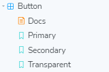
Story
Storybook은 이름처럼 Story 단위로 작성됩니다. Story 파일에 구성요소를 정의하며 사용하는데 이를 Component Story Format (CSF) 라고 표현합니다. (Story가 작성된 파일이 CSF 파일) 이 파일들은 개발 전용이기 때문에 배포시 번들에는 포함되지 않아 안심해도 괜찮습니다.
기본 사용법
Story는 간단하게 메타데이터를 Export default 하는식으로 제공합니다.
// Button.stories.ts | .tsx
import type { Meta } from "@storybook/react";

import { Button } from "./Button";

const meta: Meta<typeof Button> = {
  component: Button,
};

export default meta;
정의
// Button.stories.ts | .tsx
// ..위 와 같이 메타데이터 export default
type Story = StoryObj<typeof Button>;

export const Primary: Story = {
  render: () => <Button primary label="Button" />,
};
Button에 대해 Primary 정의가 필요하다면 해당 컴포넌트를 사용한 Story 타입으로 export 합니다.
React Hooks 사용
// Button.stories.ts | .tsx
// ..위 와 같이 메타데이터 export default
type Story = StoryObj<typeof Button>;

const ButtonWithHooks = () => {
  const [cnt, setCnt] = useState(0);

  const handleOnChange = () => {
    setCnt((prev) => prev + 1);
  };
  return <Button primary={isPrimary} onClick={handleOnChange} />;
};

export const Primary: Story = {
  name: "I am the primary",
  render: () => <ButtonWithHooks />,
};
React의 hooks를 사용한 컴포넌트를 만들 수도 있습니다. 물론, 사용할 hooks와 같은 컴포넌트를 렌더시키는 렌더를 하나 더 정의해야 합니다.
Args 사용
args 를 사용하는 법은 다음과 같습니다.
// Button.stories.ts | .tsx
// ..위 와 같이 메타데이터 export default
export const Primary: Story = {
  args: {
    backgroundColor: "#B897FF",
    label: "Button",
  },
};

export const Secondary: Story = {
  args: {
    ...Primary.args,
    label: "Secondary",
  },
};
args에 입력한 key와 value가 Button의 props에 대입됩니다. 무엇보다 Primary, Secondary 같이 다양한 경우를 만들때 재사용도 가능한 이점이 있습니다. (개인적으로 코드 가독성도 나아보입니다)
arggs의 사용은 해당 컴포넌트를 여럿 사용하는 상위 컴포넌트(컨테이너) 에서도 활용될 수 있습니다.
// ButtonGroup.stories.ts | .tsx
import * as ButtonStories from "./Button.stories";

export const Pair: Story = {
  args: {
    buttons: [
      { ...ButtonStories.Primary.args },
      { ...ButtonStories.Secondary.args },
    ],
    orientation: "horizontal",
  },
};
기존의 Button.stories의 Primary, Secondary에 정의한 내용들을 끌어와 사용할 수 있어 복합된 컴포넌트 요소를 만들때에 재사용될 수 있습니다.
개인적으로 render: () => ... 와 같이 스토리를 정의하는 것보다, args 를 사용해 props 를 관리하는 방법이 더 나아보입니다. hooks를 사용하는 경우가 아니라면 args를 사용하는 법이 가독성부터 활용도까지 더 나아보여요. 물론, 위처럼 복합 컴포넌트에서도 args를 사용할 수 있지만 최대한 활용할 수 없는 상황도 있으니 상황에 맞게 고려하면 좋을 것 같습니다.
args와 render를 같이 사용
그런데도 ! 재밌는 일이지만 render와 args를 같이 사용할 수 도 있습니다.
import { useArgs } from "@storybook/preview-api";

export const Example: Story = {
  args: {
    isChecked: false,
    label: "Try Me!",
  },
  render: function Render(args) {
    const [{ isChecked }, updateArgs] = useArgs();

    function onChange() {
      updateArgs({ isChecked: !isChecked });
    }

    return <Checkbox {...args} onChange={onChange} isChecked={isChecked} />;
  },
};
argTypes
args의 이름과 일치하는 키를 객체를 통해 argTypes를 구성할 수 있습니다.
{
  [key: string]: {
    control?: ControlType | { type: ControlType; /* Docs 확인 */ };
    description?: string;
    if?: Conditional;
    mapping?: { [key: string]: { [option: string]: any } };
    name?: string;
    options?: string[];
    table?: {
      category?: string;
      defaultValue?: { summary: string; detail?: string };
      subcategory?: string;
      type?: { summary?: string; detail?: string };
    },
    type?: SBType | SBScalarType['name'];
  }
}
argTypes - control
해당 속성을 컨트롤할 때 사용합니다.
argTypes: {
  [key]: {
    control: {
      type: "number",   // 타입은 number 면서
      min: 0,
      max: 100,         // 0 ~ 100 범위에
      step: 10,         // 10단계로 조절 가능하다
    },
  }
}
argTypes - description
argTypes: {
  [key]: {
    description: "내용을 설명합니다."
  }
}
추가로, Typescript를 사용하면 해당 컴포넌트의 Props에 주석을 달아도 동일하게 적용합니다.
export interface CustomButtonProps {
  /**
   * 이것은 버튼테마입니다. (description)
   */
  variant?: "primary" | "secondary" | "grey" | "black" | "transparent";
};
argTypes - if
뜻 그대로 조건문입니다. 어떤 props를 사용한다 할때 조건을 사용할 수 있습니다.
argTypes: {
  [key]: {
    parent: { control: 'select', options: ['one', 'two'] },

    // 'parent'가 존재하다면 control 이 보여집니다. 반대라면 false
    parentExists: { if: { arg: 'parent', exists: true } },

    // 'parent'가 true라면 보여집니다. (truthy를 안써도 내용이 같음), 반대라면 false
    parentIsTruthyVerbose: { if: { arg: 'parent', truthy: true } },

    // 'parent'의 값이 'one'이라면 보여집니다.  반대라면 neq를 사용
    parentIsEqToValue: { if: { arg: 'parent', eq: 'one' } },

    // arg가 아니라 global 로도 사용할 수 있습니다.
    parentExists: { if: { global: 'theme', exists: true } },
  }
}
argTypes - options, mapping
속성을 재매핑할때 사용합니다.
argTypes: {
  [key]: {
    variant: {
      options: ['primary', 'secondary'],
      mapping: {
        primary: 'secondary',
        secondary: 'primary',
      },
    },
  }
}
보통 Typescript를 사용하면 알아서 options도 정해주는데, mapping은 해당 값을 말그대로 다시 매핑할때 사용한다 생각하면 된다고 생각합니다. 예시로 primary를 선택하면 실제로는 secondary를 사용하는 것처럼 매핑했습니다.
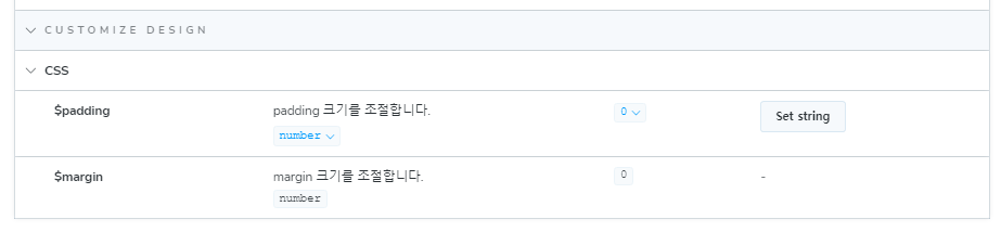
argTypes - table
table은 좀 더 상세히 나누고자 할 때 사용됩니다.
표현이 애매하지만 아래 코드와 결과물을 통해 쉽게 이해할 수 있습니다.
argTypes: {
    $padding: {
      table: {
        category: "Customize Design",
        subcategory: "CSS",
        defaultValue: { summary: 0, detail: "default는 0입니다." },
        type: { summary: "number", detail: "숫자만 입력합니다." },
      },
      description: "padding 크기를 조절합니다.",
    },
    $margin: {
      table: {
        category: "Customize Design",
        subcategory: "CSS",
        defaultValue: { summary: 0 },
        type: { summary: "number" },
      },
      description: "margin 크기를 조절합니다.",
    },
}
Auto Docs
자동으로 Docs 파일을 생성하고자 한다면 다음과 같습니다.
const meta = {
  title: "common/Button",
  component: Button,
  tags: ["autodocs"],
};
parameters 상세 설정 - Docs 에 설명 넣기
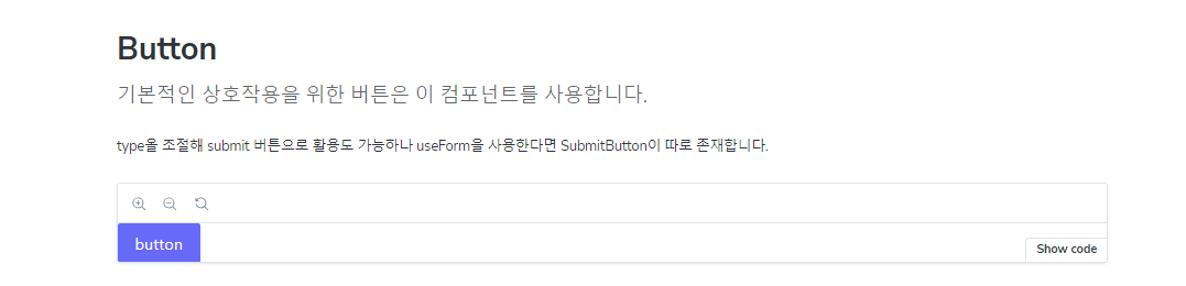
레이아웃 형태나 내용을 보충할 수 있습니다.
const meta = {
  title: "common/Button",
  component: Button,
  tags: ["autodocs"],
  parameters: {
    layout: "fullscreen",
    // 추가
    componentSubtitle: "기본적인 상호작용을 위한 버튼은 이 컴포넌트를 사용합니다.",
    docs: {
      description: {
        // 추가
        component: `type올 조절해 submit 버튼으로 활용도 가능하나 useForm을 사용한다면 SubmitButton이 따로 존재합니다.`,
      },
    },
  },
};
참고
틀린 내용이 있다면 지적해 주시고,
더 좋은 방법이나 생각을 공유해주세요.